
Actually not too much to say about this one.

I don't know: I like the crispness of this design... I mean some of the older, almost baroque, 3D signs are lovely too, but each style holds its special charm for me...

Amazing wall detail just outside 110 St station!

Station decal...
Love how the "70s" tiles frame the older (looking) details... As well: Note the not white tiles behind the bench!

Really like this! Feels crammed!

A new installment of "Exits & Stairs"!

Not really sure about the history of the bumpy tiles... I would guess that this was used before the yellow ones I showed earlier... These are as well not right up to the edge of the platform either...

Standard shot. Some of the stations though are too narrow to allow for this...
At times I'm standing all the way on the edge of the platform to get the image...

Interesting variation of the station ID... With decoration in the big print version... Have not seen this before!

Have not seen this before either. Pretty though!

Very fitting! Very round numbers make much more sense in a circle!

Tiled around the corner! Much more pretty and most likely more labor intensive as well...

A flying pig: Part of Laura Bradley's "City Suite", 1994

Same station and artist... Not sure what this is? Flying trash can? I think it could be a skyscraper...

Love this. Part of same piece! Simple, but elegant! And patriotic too! ;)

Colors are weird... Still like this one!

Had to wait for quite a while to take this one... Busy evening at that station!

When looking at this I couldn't figure out what this bump guard was for... And I still don't know!
But I really like how it looks!

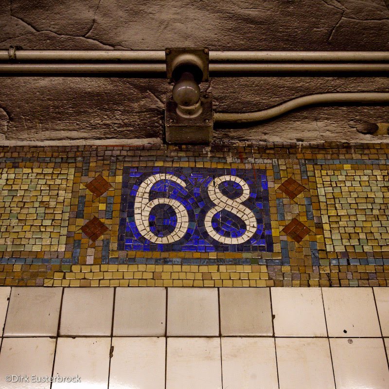
Weird stair & exit combo... We're at 68 St - Hunter College station (1 line)...

Wow! Love the font here!!!

Had to grab the detail as well! Might want to go back to reshoot earlier in the day though... Light was really dim here...

Had not seen 4 of the debit / credit card metrocard vending machines in a row before...
I guess cash is out with the young at the college here...

Could not have invented this any better! ;)
Round numbers in a square. Back to normal programming! With bulb on top... Curious if they still work... Maybe just emergency lighting... But in some places the bulbs were missing from their sockets...

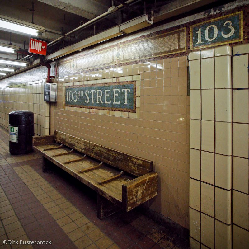
Really need to speak to someone who has been around the subway here a long time... I would guess that this style renovation (keeping with the old mosaic station decals, etc.) was after a period of "let's just put new tiles over everything" approach... Mmmh... In any case: Here's the bench & station ID combo at 68 St - Hunter College. Interesting how they just recreated missing parts with paint...

I would think this is an early version of the bumpy tile... I call it sticky stripe...

70s tile in action... I think that this was part of a former renovation that still can be found in some stations, apparently only remaining in far out corners...
No comments:
Post a Comment